
Design UX/UI et web
Je conçois les sites que je construis.
Comme concepteur et développeur web sénior chez Jonas Club Software, j’ai mené des clubs privés du plan du site et de la maquette interactive jusqu’au lancement. Chez Design Republik et TeamQ, j’ai conçu des sites en plus de les construire. Cette page présente ce volet de mon travail : ma façon d’aborder un design, ainsi que la palette et la typographie de chaque site que j’ai conçu ou construit. Chaque étude de cas précise exactement mon rôle.
Ma façon de concevoir
La structure avant la couleur
D’abord le plan du site et le contenu, puis une maquette interactive que le client peut parcourir avant qu’une seule ligne de code de production ne soit écrite. Chez Jonas, j’ai mené ce processus de bout en bout pour les clients de club de premier rang, jusqu’à la construction, l’assurance qualité et la migration.
La maquette devient le site
Je conçois dans Figma, Adobe XD, Photoshop et Illustrator, et j’écris moi-même le PHP, le JavaScript et le CSS, de sorte que ce qui a été conçu est ce qui est livré. J’utilise l’animation là où elle explique quelque chose, comme le travail en GSAP et ScrollMagic sur le mode sombre du British Club.
Accessible par défaut
Tous les sites de club que j’ai livrés respectaient la LAPHO et les WCAG : contraste, états de focus, navigation au clavier et typographie qui reste lisible. J’ai aussi été assistant d’enseignement dans le bootcamp UX/UI de l’Université de Toronto.
Palette, typographie et design, site par site
Tous les sites que j’ai conçus, regroupés par agence, avec les couleurs et les polices relevées sur le site en ligne. Les clients sont propriétaires de leur site, et certains ont changé depuis que j’y ai travaillé.

At Jonas Club Software
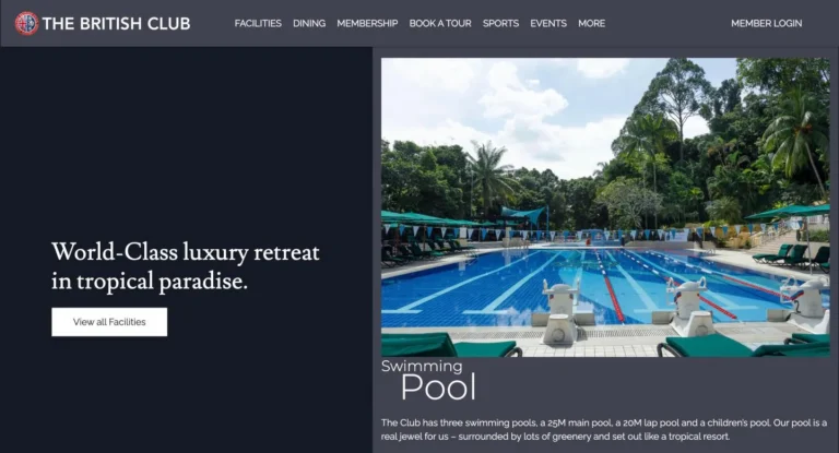 The British ClubLusitana / RalewayRenaissance-style serif + elegant geometric sansA colonial club in the tropics. Navy panels and slate type sit beside full-height resort photography, with a calm Renaissance serif for headings and plenty of air between sections.Effect The first dark mode at Jonas, with frosted-glass panels and captions that slide in on scroll, built with GSAP and ScrollMagic.
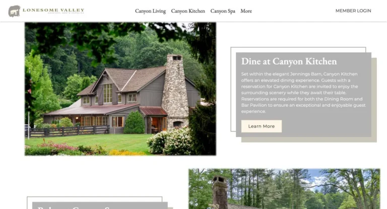 Lonesome ValleyEB Garamond / MontserratOld-style serif + geometric sansNature, drawn by hand. Dry-brush edges between sections, photographs that fade out like ink on paper, EB Garamond over cream, and an olive band the colour of the valley's hillsides.Effect Dry-brush ink edges, photos that fade out like ink, and my own script that swapped the band's background on hover.
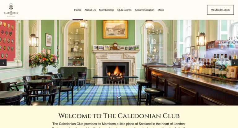 The Caledonian ClubCinzel / RalewayRoman inscriptional capitals + elegant geometric sansScottish heritage in the middle of London. Carved Roman capitals in plum and cream, photography of the club rooms, and a restrained layout that feels like the building itself.Effect Caption cards hang off each tile over a gold offset frame, then grow to fill the photo on hover, in pure CSS.
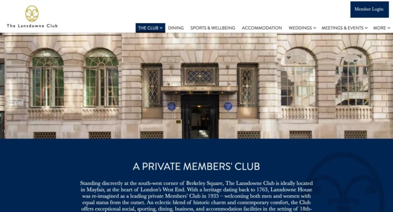 The Lansdowne ClubBrandon Grotesque / BaskervvilleGeometric sans + transitional serifArt deco Mayfair with a colour for every department. Navy and old gold carry the club, and dining, sports, weddings and events each bring their own colour to the photos, the section edges and the footer.Effect Every department has its own colour, and the photo tiles, section edges and art deco footer change with it.
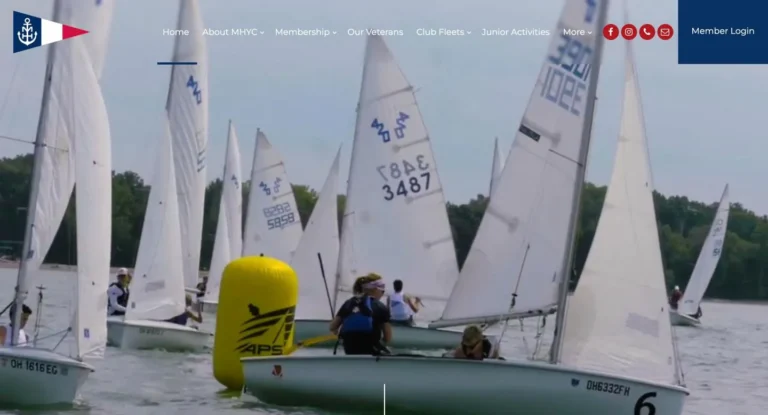 Mentor Harbor Yachting ClubMontserratGeometric sansSummer on Lake Erie in the colours of the club burgee. Navy, white and red, Montserrat throughout, frosted glass over the photography, and a homepage that moves with the scroll.Effect A scroll-to-top ring that turns as you scroll and changes colour with the section behind it, a pinned harbour in GSAP and ScrollMagic, and frosted glass.
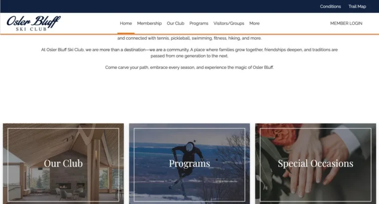 Osler Bluff Ski ClubPlayfair Display / RalewayHigh-contrast serif + elegant geometric sansFour seasons on the escarpment. Frosted glass panels float over the club's own photography, Playfair Display headlines sit on winter navy, and trail-marker orange marks the way.Effect Glassmorphism: the homepage doors frost into navy glass on hover, and room descriptions sit on frosted panels.
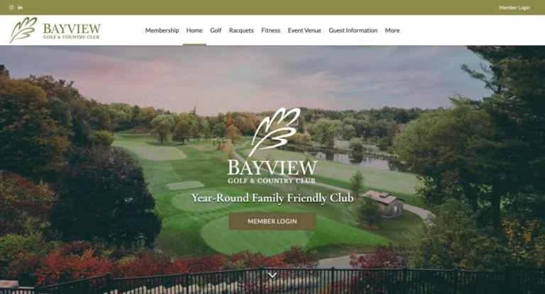 Bayview Golf and Country ClubCormorant Garamond / LatoOld-style display serif + humanist sansCountry club calm. Wide photography of the course opens the page, the section titles are burned into the photos with a CSS colour-burn blend, and olive and parchment keep it quiet and premium.Effect Section titles burned into the photos with mix-blend-mode: color-burn.
- Private11 more sites are privateRequest to see full portfolio


At Design Republik
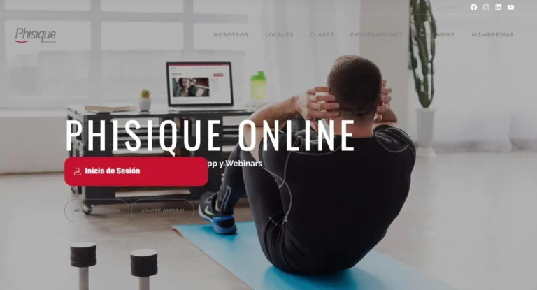 Phisique OnlineOswald / MontserratCondensed gothic sans + geometric sans
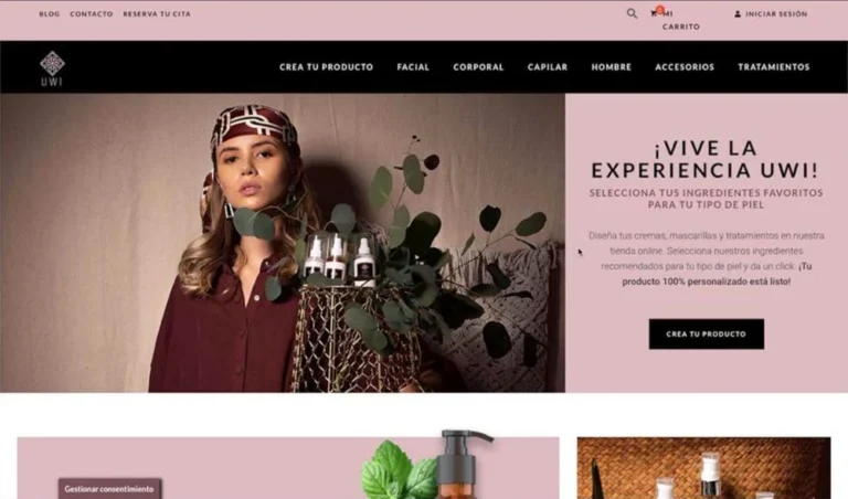 UWI CosmeticsRoboto / LatoNeo-grotesque sans + humanist sansAncestral beauty told like an editorial. Dusty rose and black frame big portrait photography, the menu runs in spaced capitals, and a build-your-own flow lets shoppers mix their own products.Effect Crea tu producto: a conditional WooCommerce builder where every choice shapes the next, so shoppers mix their own products.
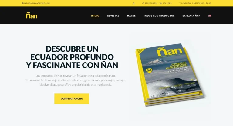 Ñan MagazineLato / RalewayHumanist sans + elegant geometric sans
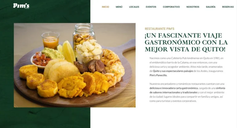 Restaurante Pim’sIbarra Real Nova / LatoSpanish transitional serif + humanist sansOld Quito warmth in a modern layout. A split hero pairs bottle green with food photography, a classic Spanish serif carries the headlines, and gold and brick red work as accents.Effect The hero is a layered Slider Revolution scene with parallax, a film of the food playing beside the logo.
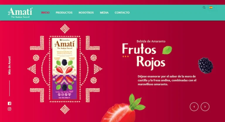 Amati FoodsAvera Sans / OverlockRounded humanist sans
- Private7 more sites are privateRequest to see full portfolio


At TeamQ Developers
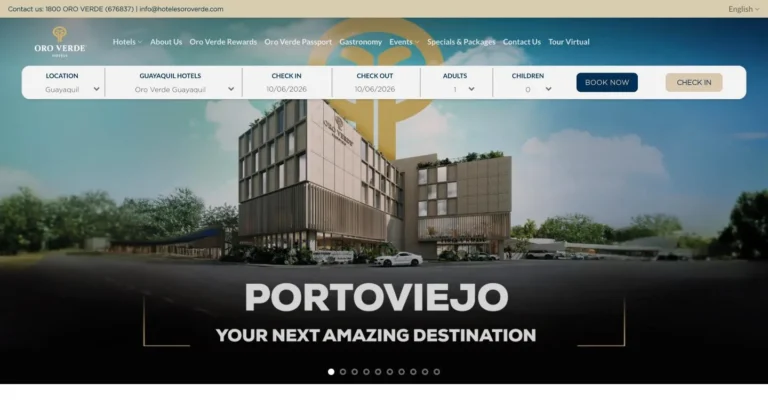 Oro Verde HotelsHermann, Gotham / RobotoNeo-grotesque sans
 EnergyNowOpen SansHumanist sans
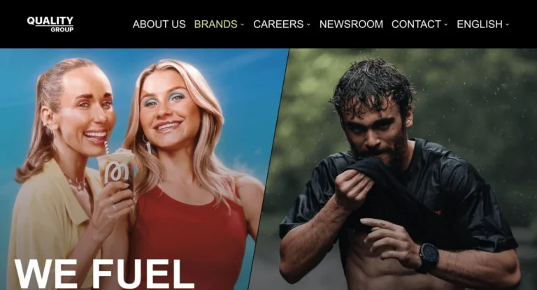 The Quality GroupArialNeo-grotesque system sans
 SPL GroupEurostile / PoppinsSquared technical sans + geometric sans
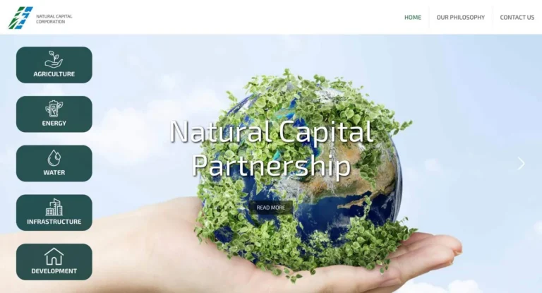 Natural Capital CorporationExo 2Geometric sans with a technical edge
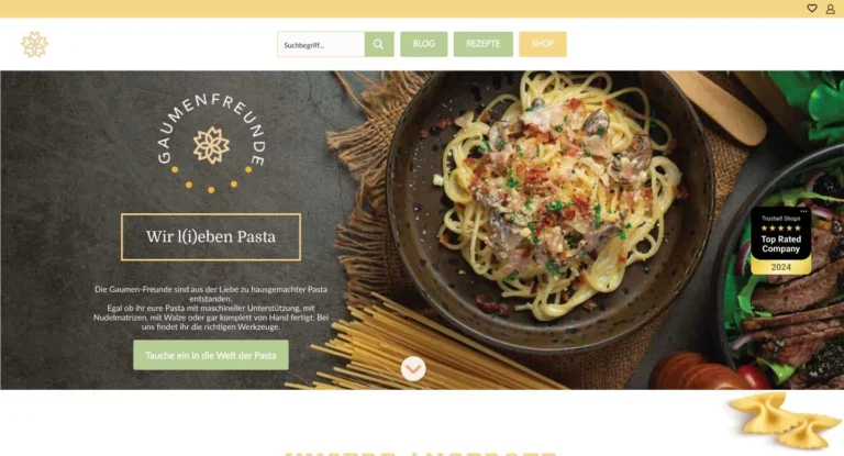 Gaumen FreundeDomine / Open SansSturdy text serif + humanist sans
- Private15 more sites are privateRequest to see full portfolio


